Sunday, March 17, 2024

The Script is (Finally) Done!

     It took me long enough, but I finally finished the script! I'm really excited with what I've come up with, and I'm looking forward to getting started with filming this upcoming weekend! I'll probably make some edits here and there after this post, but here is the full Stare script!


Friday, March 15, 2024

Research For the Script

     This past week, I unfortunately didn't get as much done as I wanted to, including finishing the script. While part of the issue was lack of proper scheduling and time management admits a terribly busy week, the other half of the issue was figuring out how to create characters, particularly the green and yellow characters who are meant to depict how people who are dealing with survivors guilt or someone who is horribly afraid of dying. I want to be able to portray these specific characters as carefully as possible since they are characters that are more rooted in actual conditions and I want to make sure they are represented accurately and respectfully.

Yellow 

 
 Yellow as a character is someone who is meant to represent people with hypochondria ( also known as illness anxiety disorder) and death anxiety. Hypochondriasis, according to sciencedirect.com is the excessive fear of serious illness. People with the disorder often experience high levels of anxiety and believe that medically unexplained symptoms (MUS) are caused by serious illness. Death anxiety, is the conscious/unconscious fear of dying due to being aware that death can occur at any moment. While the associated between the two is not studied profoundly, those who experience death anxiety tend to be more prone to anxiety disorders, and it is believed that death anxiety is likely an underlying/ contributing factor to some who have Hypochondriasis. When in tandem, Hypochondriasis and death anxiety manifest through the person believing their MUS are because of issues like organ failure, and bodily damage that could lead to death. 


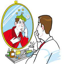
    As I mentioned before, Yellow is meant to be a representation of how someone may act when they have these disorders and come face to face with death itself. Instead of what I and originally intended for  the character and having them be addicted to pills, Yellow will be a person who physically looks exhausted, due to lack of sleep from hype fixating on every sensation in their body and fearing that it means their body is failing them. When the character of Death finally gets to Yellow, they are checking their temperature, and panic when they realize they have a low grade fever (even though they have a jacket on to keep the cold out) and have run out of Acetaminophen. Once they realize death is present, they panic for they believe their worst fear is coming true and that they were right about all of their MUS being caused by something more severe. 

Green


    The green character is meant to be a representation of someone with survivor's guilt after having gotten in a car accident where the person they were with unfortunately passed away. 
According to the National Library of Medicine, survivor's guilt is a response when someone survives a traumatic event, while others do not. People who experience survivor's guilt may experience symptoms like flashbacks or nightmares of the events, irritability/anger, trouble moving past the event, and having constant thoughts about what happened and that they didn't do enough to prevent the event from happening. A lot of the symptoms are similar to that of those with PTSD. 

    Within Stare, the green character will be a representation of someone with survivor's guilt. As they mourn the loss of their loved one, they can't help but blame themselves, and wonder what they could have done to prevent their death. When they notice Death, they demand to know why it wasn't them that died instead of their friend, giving a "why not me?" moment. 

Sources

https://www.healthdirect.gov.au/hypochondria

https://www.sciencedirect.com/science/article/abs/pii/S0022399918306202

https://www.ncbi.nlm.nih.gov/pmc/articles/PMC10590163/#:~:text=Survivor's%20guilt%20is%20the%20response,anxiety%20disorders%2C%20and%20complicated%20grief.

https://centerstone.org/our-resources/health-wellness/understanding-survivors-guilt/
Wednesday, March 13, 2024

Print Component Research

    Post card advertisements make it possible for filmmakers to easily advertise their films at film festivals by handing out the postcards to the people there.

Us. Them. Me. by Quincy Woo


    This is the postcard for Quincy Woo's final thesis film that was to be shown at the Oregon Independent Film Festival. The way that the postcard itself is structured draws the audience in, with the two figures on each side of the text helping to establish a more serious tone as they are cast in a shadow, almost like they are fading into the black background. This technique creates a meaning in the two character's relationship, possibly something keeping them apart, while still being connected to one another. This also allows for a reader's attention to be further drawn to the white text in the center (which stands out very well against the black background), that displays the title of the piece, the director's name, as well as the three acclaims it has already received. Having the "Official Selection" for the screening at the Oregon Independent Film Festival crest going at the top of the pyramid of three brings it to the audiences attention, and highlights it as the most recent, and relevant to the advertisement itself.

Dear Peter by Scott Willis


    Although this post card is for a short film documentary, I was still quickly captivated by its visuals, so I thought it would be of value to mention. The visuals are split in half, with a slightly distorted, picture of the lower half of a man's face being shown as it fades into a solid dark blue, where the name of the piece, who directed it, and all of its acclaims are displayed. The editing for the image of the faint blue and distortion, conveys a feeling of mystery, indicating that something is meant to be solved or figured out within the film. I really like the idea of doing a sort of fade into solid to display the information needed on the post card, I think its really effective in capturing the audiences interest. I think it would be cool to play with that and do something with multiple colors fading into black in the middle, where the name would be displayed.

Sunday, March 10, 2024

Putting Social Media Together

 The Logo/Profile Picture

    For the profile picture for the Stare Instagram page I thought of at first using a picture of Death with the word stare on it before realizing that I don't think that would look too good, and that I would much rather not have any of the character's faces on the profile photo. I did still want to somehow incorporate the room that occupies the majority of the setting in the logo. So, I decided to use a picture that I had taken of one of the corners of the room as the main background for my profile picture. 
First option.
    The next thing I did was plaster "Stare " right onto the middle of the image. Then began my hunt for the perfect font. Thankfully I didn't have to go too far, as I found one on Canva called "Bahianita". I picked this font because I felt it reflected the atmosphere that I am trying to create for my project very well, something sort of abstract while still understandable. I went through some different options in terms of how I wanted the title to be displayed since I wanted each character to be represented somehow. I was torn between two options but in the end I ended up with "Stare" in the middle in solid black, with very translucent, multicolored versions of the word spread throughout the image, these representing all the other characters. I liked the first option, however I didn't want the colors to be as prominent as they were in that option, as well as I didn't want the corner of the wall to be covered. It's safe to say I am thrilled with the final result.

Final choice.

    Once I made the logo, I added it to the social media page on Instagram which is linked here: @stare.shortfilm

First Post

    For my first post, I decided to create a very short reel of the empty room and then Death appearing out of thin air. I took some of the clips that I had taken last weekend, and edited them together using CapCut. I removed the sound from both of the clips, and added a copyright free sound of florescent lights buzzing over the second clip to create a more ominous atmosphere. I also desaturated the clips since that is how Death is meant to start out looking as at the beginning of my film. 


Monday, March 4, 2024

First Group Meeting


    Today in class, we did group meetings for our portfolio projects, and it was honestly incredibly helpful. We went around and talked about each individual project. We all said that we we're struggling with scheduling since, it seems to be, that March is a ridiculously busy time of year for everyone. The first person to talk about their project was Tai. She was having trouble figuring out when to film, since she's incredibly busy, and will be leaving for a family trip over spring break. The group suggested to plan out as much as possible with her group and write the script in order to be better able to find time when to film. Migue went next, and his project sounds super interesting. He's doing a silent short film, and using dance as his form of communicating the story. He asked for ideas on locations, since he wants to do it in an empty white studio but wasn't sure where to do it. We offered some ideas, I suggested the Rubell Museum, since he had mentioned that our teacher suggested an art gallery if he isn't able to get an empty studio. He took note of the ideas we gave him, and I'm honestly super excited to see what he ends up doing.

    Yoav, Morgan, and Abby are all doing film promos. Morgan had the idea to make each of the two trailers a different perspective of one of the main characters. We all liked the idea and said it would be really cool. Yoav expressed his issue with scheduling because of how busy he is and the availability of the people he wants to be in his documentary. Abby asked for advice on what to do for the social media component. This in particular was helpful to me, since I wasn't entirely sure what to do either. Tai suggested doing a banner like post, where each individual post ends up creating a bigger image on the Instagram grid.

    I went last in my group, and after explaining the concept of my project, Tai pointed out that I'd have to be careful with how I show the colors since blue and yellow specifically are often associated with sadness and happiness and not peace and obsession. I explained that I plan on using a light blue, almost like an angelic blue, and a nastier looking yellow to showcase the perspectives I'm creating. I then asked the group for advice on what to do for social media, and Abby suggested doing highlights, one of for each color and perspective, and in each highlight I explore the perspective itself. I like this idea a lot, and will most likely implement it later down the line. The group also suggested I did a banner post, although I'm not quite sure what I'd do for that. Overall, though, I feel like it was a really helpful and productive group meeting.

Sunday, March 3, 2024

Test Shots & Social Media

Capturing Test Shots

    As mentioned in my previous post, I spent a good portion of my Saturday driving down to my dad's office in Doral to get some practice shots for my short film, so I can start experimenting with editing, as well as get content for the social media page. I didn't just go down to Doral to get shots of an empty conference room though, I was able to have my best friend, who I met through doing theater outside of school, Clara Pangalangan to come with me. They will be playing the personification of death. I picked them specifically, because I knew that they'd be able to capture the monotone yet haunting look that I was looking for when I first thought of the idea for Stare

      When we got to the office, I was a little disappointed to see that the table was a lot bigger than I had originally thought, as I wasn't able to move it out of the room. however the wall were bare aside from a white board and a map that I could easily just avoid filming. We did have to work around the table and rolling chairs, which was quiet funny at times since we were situating everything and moving around, only to realize there was the corner of a rolling chair appearing at the very corner of the frame. At one point, I literally sat on the table in order to get an angle of the shot of Clara standing in the corner (shown above).

    I got quite a few shots of them in the room, walking, and turning. I even got a shot of them staring at the camera, with a sunset lamp shining in their face, since I was trying to experiment with how I would show the end sequence of "Death" having collected all the colors. Unfortunately, I'm not entirely convinced of the sunset lamp creating the look I wanted but I still think the shot itself looks pretty cool. I also had Clara bring some colorful clothes, so I could experiment with editing and color isolation, but I will see how that goes later on this week.

Starting Social Media Page


    This week we are supposed to start the social media aspect of our project, so that's exactly what I have done. I opened up an Instagram page, as I felt Instagram would be versatile enough to allow me to create various post types like  video clips and images. I plan on taking inspiration from the Midsommar social media page, and creating some form of countdown later down the line, one in which each character is highlighted in each post. As for now though, I have created the profile @stare.shortfilm. This upcoming week I plan on creating the profile photo, and initial posts. 
 

Beginning of Script Writing & Finding a Name

Script Writing

    In class this week, I focused on writing my script. I had originally planned on finishing it and beginning filming on Saturday March 2nd, but I then realized that was entirely unrealistic, especially if I want to create something of real quality. I did still end up getting some shots at my dad's office, since he has a pretty empty conference room so I can practice and experiment with editing and have some content for the social media page, but more on that in the next post.

  I am not yet done with the script, however as I am writing I am realizing more how dependent the piece is going to be on specific props and costumes in order to tell each character's story in the most effective way possible. This is going to be even more challenging since I am limited to the resources I currently have and a very limited amount of money I could actually spend on getting props that I can't find on my own. Good thing the dollar store exists. 

    Throughout the script, I also decided to not add names to the characters. They are simply identified by the color that characterizes them, or in the personification of death, just "Death". I thought of doing this because in not giving them a name, the characters can represent anyone. It is also just more simple at this point in the writing process. Them having or not having names will not effect the plot, however I do acknowledge they could represent anyone even if they did have names. 


"Stare"

 
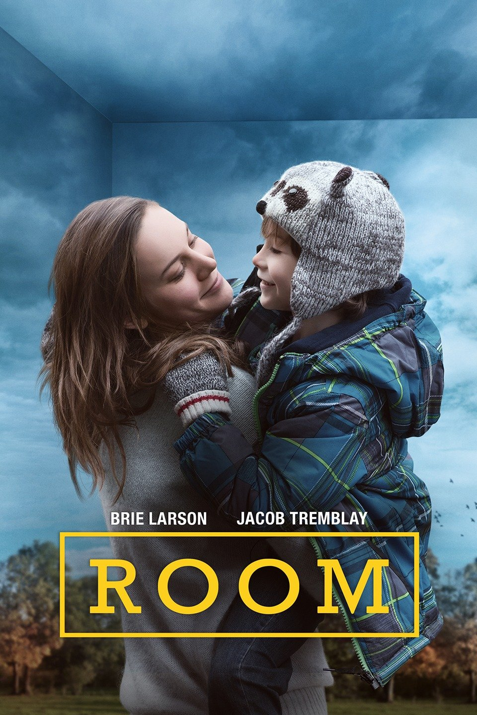
   Another realization that dawned on me while working on the script, was that I needed a title for the short film. At first I thought of naming it "The Room" since the main setting took place in a room, but that didn't go with what I was trying to create. It made the short film feel more like a horror situation, which is not what i am going for. Just "Room" didn't work either as, again, it didn't quite go with what I wanted, and also there is a very popular 2019 movie staring Brie Larson with the exact same name. I tried experimenting with maybe making the title the name of the character that would be personifying "Death" but I couldn't find a name that really stuck, and I also didn't want "death" to be something that could be so easily identified by a name since the whole point of the short film is how death can be perceived in many ways, and it is not just tied down to one label or perception. 
   
     I still had no title for my short film and felt completely stuck. Out of no where, I'm washing my hair and getting ready to go to the office to get some practice shots for the project, when the name "Stare" dawned on me. It was perfect. It encapsulates my film as a whole without giving anything away. "Stare" literally refers to the fact that the personification of death is always staring directly at the camera, but it also refers to the idea that all the characters which "Death" encounters, have death staring them in the face, and subsequentially, so does the audience. 


Project Components

       Well, that's a wrap! Bellow are the links to the project components! Enjoy :) Instagram: @stare.shortfilm Postcard: Front of Pos...