Wednesday, April 10, 2024

Project Components

     Well, that's a wrap! Bellow are the links to the project components! Enjoy :)

Instagram: @stare.shortfilm

Postcard: Front of Postcard

                     Back of Postcard


Short Film: 

STARE One Drive Link or

Critical Reflection

     STARE explores the many perspectives and emotions that one can feel towards death, and how each belief is valid in its own right, as death can be whatever one perceives it to be. These different perspectives are highlighted through the colored lighting and costuming throughout the short film. The haunting depiction of Death seen through the emptiness of the room they reside in, as well as the quiet buzzing heard whenever their presence becomes increasingly prevalent.

   The short film concept for STARE was inspired by Netflix's BoJack Horseman for the way it addresses heavy topics, Jack Stauber's Opal for its disturbing atmosphere, and the short film World of Tomorrow. Through these three pieces of media, I was inspired to create something that created a tense and almost ominous atmosphere, while also having a true meaning behind it. When watching World of Tomorrow, I got the idea to make my piece about death, and how people fear it, this later evolving into addressing other perspectives of death and how they would react when coming face to face with death itself. 

    The short film embraced the conventional use of color in film in terms of what color can symbolize, while also over exaggerating each perspective's color through lighting and costuming. By doing so, each perspective's emotions is brought to the forefront through more than just the dialogue or the acting. The piece has embraced aspects of the psychological film genre, through the exploration of human emotion and how two people can feel drastically different about the same subject. 

    Certain perspectives, such as Green and Yellow's, required careful research as they respectively represent survivor's guilt and those who have illness anxiety disorder. Through the use of sources such as the National Library of Medicine , the representation of people with those disorders is carefully fleshed out, to show different sides of those with the disorders. The pairing of the color green and the character dealing with survivors guilt after the death of a friend, works well as green is often used in film to represent guilt. The person crying and even becoming irritable are more exaggerated depictions of how someone who has survivors guilt may act or react to certain people. The none-diegetic audio in the background shares an insight into the mind of the character, who is forced to relive the events that she so wishes she could change the outcome of. 

As for those with Illness Anxiety Disorder, known to some as Hypochondria, the character Yellow represents someone who is incredibly hyper aware of their physical body, even going as far to believe that none symptoms and feelings, are caused by something much worse which is illustrated through their dialogue. In this particular case, the character has what some may call death anxiety, which further causes them to believe that their physiological feelings are caused by something serious that could potentially kill them, causing them to become more anxious. It may sometimes cause people to take or ask for prescribed medication that they don't really need in order to treat these "symptoms". The color yellow adds to this idea of hype fixation, as yellow can be used in film to represent obsessiveness. The none diegetic audio of a heartbeat in the background also helps to further represent the hyper awareness the character, and some people with Illness Anxiety Disorder, feel over their own body. 

    Along with those two, Blue is representative of someone who is very at peace with death, perhaps someone who is even religious and believes that there is a life to come after one dies. This is why there is very peaceful none diegetic music playing in the background of their scene, and why it is particularly noted in the script that Blue physically hands Death a flower as a sign of goodwill and peace. Blue being the only character that reaches out to Death and physically hands them something is also an indicator of how accepting and at peace they are with the concept of dying. Purple is representative of those who are reckless and for one reason or another, do not think that their dangerous actions will catch up to them, this is conveyed through him smoking, as well as the various alcohol bottles indicating drinking. This character is the only one that is implied to actually die of the characters shown on screen, almost as a warning for those who continue to be reckless and do things that actively hurt their health and well being. 


    The branding of STARE is developed mainly through the social media, this including stills from the short film itself, as well as a lot of teasers featuring each character, but always featuring the empty room in which the personification of death spends the film in. The buzzing in the background whenever Death or the room is visible or whenever Death's presence is more prominent creates an ominous and looming atmosphere which is well depicted throughout the social media. Even on the postcard, the multicolored gradient in the background is reminiscent of the ending of the film where all the colors begin to flash on Death, representing how death is whatever someone views it to be, and how each perspective or belief is equally as valid as the other. Even the profile picture of the social media, contains each color that represents each given perspective, and includes the blank wall from the room in which Death resides in, the plain cool light, creating an almost "backrooms" style feel to the room, making it that much more haunting.


    Throughout the social media the target audience of young adults ages 16 to 26 are able to view content to do with STARE, including the various teasers and Instagram story highlight of each character. The short film itself is meant to provoke thought and shine a light on how various perspectives and opinions on subjects such as religion or death can coexist and still be equally valid. By also creating representations of these different perspectives, it allows for those within the audience who may identify with some of the aspects of the characters to feel more seen, and like their view on life is valid. 


Monday, April 8, 2024

Social Media Update (again)

    So I started a countdown which includes a daily teaser of some sort for the release of my short film. Yesterday, I used a clip from Yellow's section and created a teaser with suspenseful music and a heartbeat in the background. I'm planning on making posts which create a full image of the grid on the 10th, to announce the release of the short film, so I'm calculating at least four more feed posts. As for story posts, I took full advantage of the eclipse that happened today. It may be a little cheesy, but I honestly really love it, I think its silly. And the picture I got fits the ominous vibe that I try to emulate through the social media so I think it works perfect! Here it is: 

Post Card !

    As I mentioned a couple posts ago, while doing a group meeting, someone had suggested that I did a Tarot card style post card, with the card being that of Death. Well after searching for what felt like forever, I realized I wasn't liking any examples or templates I found. So I found a completely blank page with a dark double boarder. I then removed the background from one of the stills, of Clara as Death and put it near the bottom of the inside of the black boarder. I made it a little transparent, and then added two different multicolor color gradients that I also reduced the transparency of to mimic the look of the lights on the white wall in my film. I decided to place the Instagram handle on the bottom of the front of the postcard and not on the back as well since the back only has the name of the film, the logo for the Subtropic Film Fest, and where and when the short film would screen, and I feel like it would have been way too wordy. 


  As for the film festival I picked for my short film, I decided to pick the Subtropic Film Fest that focuses on highlighting works by creators and filmmakers that are located in south Florida, and creating an overall better environment for local filmmakers. The film festival is also known to work with other film festival organizations and art institutions which could help my film reach broader audiences that are potentially interested in this type of short film.

Sunday, April 7, 2024

Social Media Update

    Along with editing, I've also been working on the social media aspect for this project. I have created a highlight for each of the characters, including Death, and have posted an interactive story post where I asked followers what they would say if they came face to face with the personification of death (morbid I know, but very fitting if you ask me). I also posted and uploaded an updated version of the profile photo, one that only includes the four colors of each character, instead of all six colors that were part of the original concept. I like how this profile photo looks a lot better, since I feel it's more dynamic, than the original which had the different transparent colors all stacked in lines. This one has the four transparent colors overlapping each other across the photo, which looks a lot more visually interesting.

    Along with this, I've also created a short teaser, announcing the release of the short film for April 10th, the same day this project is due. I posted this teaser on the main feed of the profile , as well as on a story post which was added to the black highlight, both captioned "come face to face with Death on April 10th". I thought this would be a good way to create excitement for the film, and I even posted it on my personal account's story, garnering the project more attention from fellow classmates and even a few family members who now follow the project's account and reposted the teaser on their own stories.


    As for other feed posts, I posted stills from the film, of each color in pairs, with death in between each color, to show the contrasts of each character's perspective. For example, yellow and purple are paired since Yellow is overly concerned with the idea of death, while Purple is unphased. Then, green and blue are paired up since they too are opposites as Green is not at at peace with the death of their friend while Blue is completely accepting to towards death. 

Friday, April 5, 2024

How Editing Went

    Over this whole week I've been working hard on editing my short film with the goal of finishing it this weekend. I'm pleased to say I've done just that! I had originally mentioned that I had issues with the length of my short film, but after adding some clips and getting the footage I forgot to get of the empty room, I made the short film get to 4 minutes and 55 seconds. Like I mentioned in my previous post, I had planned on editing on Adobe Premiere Pro, but unfortunately neither of my computers were able to support such a heavy program, so I ended up using CapCut after talking to my friends in the class, who mentioned they also had to resort to the same thing. This worked out really well, as it allowed me to work on the project during my spare time at school and when I was out of the house. 

    I split the the days up by priority, first focusing on the look and coloration of the short film and then focusing on sound. For coloring I made it so each color character was incredibly saturated, while Death was very undersaturated, but would slowly gain saturation and they also gained another colored aspect from the other characters. I messed around with a grainy filter here and there, and realized I didn't really like the look, so I kept the filter very minimal.

    As for the sound, this took the longest (almost two whole days). For the ending, I already knew what I wanted which was something very peaceful, yet intense. It wasn't hard to pick copyright free ambient music off of YouTube (where I got all of my sound effects). 


For Yellow's section, I decided a heartbeat in the background would be most fitting since they are always so worried about their physical "symptoms" and what they could mean, and as they began to panic more, the heartbeat gets faster. For Purple, since the character itself doesn't care about death, I figured I'd keep it simple and just add some outdoors noises to the background, since I had to remove them from the original clip since it was way too loud and drowning out Graesen's voice. 

    Green's section was by far the hardest as nothing seemed to fit right with the scene. I tried everything, from sad music, to no background at all, but nothing fit. I knew I needed audio in the background because it felt too empty, so I turned to my friend Grace who had taken this class last year for advice. I showed her, and couple of the people who were in the project what I had and asked what they thought. They liked it, but also didn't really know what to put for the background. Grace agreed that something was missing from Green's section. That's when my sister Mariana, who plays Green, suggested something like traffic noises. And so that's what I did. I made the background noise for Green's section be an auditory representation of Green reliving the car crash and moments after, with the sound of the car crashing and an ambulance in the distance. 

After sending the first draft to Ace and Gaby for some feedback, and making some final adjustments, like adding a zoom out animation to the end credits to make the empty room a little more visually interesting, it's safe to say I'm finally done! Overall, I loved how the film turned out and I am so proud of myself for what I've created. Getting this short film edited has been my main priority this past week, and I'm pretty sure my friends and family are ready to stop hearing me talk about it all the time. Still, I'm so excited to show everyone what I've created!

Tuesday, April 2, 2024

Final Group Meeting (oh my)

    My oh my the clock is ticking and the end is terrifyingly near. As we enter the last week for the project, we had one last group meeting to check on everyone. Its safe to say that overall, everyone in my group is doing well, and has a plan for where they are going. Same for me.

    Although not mentioned yet on my blog, I have started editing and have most of the film at least sequenced together. I tried to use Premier Pro at first, but my computer wasn't able to support it and would constantly shut on and off, so my next best option was to edit on my phone using Capcut (more on that later). But I mentioned to my group that I did have most of my project sequenced together, aside from a shot of the empty room that I forgot to get which I am getting later today, and the end credits. That being said, I am currently at a four minutes for my project, which has me a bit nervous, but I have a solution! In the end sequence, when the colors are flashing on death, when a color that matches a character appears, it will cut to a flash of the character to add time to my project. 

    As for social media, I told them I was planning on creating a banner post and some story posts for each character. For the post card, I mentioned highlighting Death and having a picture of them holding the flower like at the end. Tai mentioned a really cool idea that I'm thinking of doing of making the post card look like the death tarot card. Abby also mentioned a website that has royalty free sound effects and music that could be useful for my project called artlist.io.

    While the pressure is most definitely on, I feel confident that I'll be able to get everything done well!

Monday, March 25, 2024

Production Overview!

     I am happy to say that I have the full short film shot!


The morning started with me covering Death's purple shirt in fake fake blood using food coloring and setting it out to dry. Then my dad picked me up, and we headed over to Trader Joe's to get blue flowers. When I got there I realized that naturally occurring blue flowers are decently rare, but I was able to find a bouquet of blue flowers with yellow centers that were gorgeous and perfect. Once I got to my dad's house, we cleared out the office space, and waiting for everyone to show up. I had told Clara to get to my dad's house at 1pm since I needed to get the most shots and takes with them. We had a small issue with the purple shirt since the red food coloring hadn't show up as much as I thought it would, so I took some of the fake blood I was going to use for purple and smeared it onto the shirt. Then we hung it to dry in the bathroom and used a blow dryer to speed up the drying process.

    Everyone else started arriving at around 2pm, and by then we basically got all of the shots done for Clara. Once everyone got there, we got the shots for Yellow, Green, and Blue without any hiccup. Since I made sure we'd have plenty of time in case something went wrong, we were all able to hang out and take a break between takes. Clara did the bruise make up for Mariana, who was playing Green, and it ended up looking really cool. They also gave Ayami, who was playing Yellow, some eye bags to make her look more tired. Once we got all the shots for Death, Yellow, Green, and Blue, we were only missing purple, but we had to wait for the sun to go down since it would be filmed outside and we needed the purple light to be seen. We had a couple hours, so we all hung out and ate some snacks, and eventually everyone left, and me and Graesen drove Mariana home since I wouldn't need her help to film this last part.

    By the time we got back to my dad's apartment, the sun had set enough where we could start setting up. Graesen still had not tried the herbal cigarettes that my friend Ace let me borrow for the project (Ace used the same cigarettes for his AS level project last year), and so he tested one out and we both realized just how terrible they smelled (but at least they looked realistic!). After that we set up the bottles into the right spot, and set up the camera (my phone) and the light. We go to turn the light on... and nothing. The light doesn't turn on. We thought maybe it was the outlet, or the plug, or even a loose wire. But nothing got the lamp to turn on. At this point it's 7:45pm and I'm stressed. My dad, Graesen, and I run over to the nearest Walmart and thankfully there's a color changing sunset lamp, and we grab it, pay, and drive back over to my dad's to get the last section for the project. After a couple of minutes of confusion, and I'll admit slight panic on my part, we finally got the new lamp to work and got started on the final part that I needed. The rest of the time went without a hitch, however cleaning up the fake blood got a little tricky since I didn't realize it would stain skin and it subsequently stained Graesen's hands red, but we got it (mostly) out!

     Overall filming day went really well, besides a couple bumps at the end but I'm so happy with how the shots came out! I am super excited to start editing and hopefully start getting more posts on the Instagram! 


Props (so many props...)

    While production is already complete, I just realized I never made a post discussing props, so before getting into production and how that went, let's take a little dive into the props. For "Stare" I need a lot of props and specific costume pieces in order to make the film look how I want. I have a little notes page on Notion with literally everything I need for this project so I made a check list of everything I need, and checked off all the things I already have. The green flannel and yellow button down I borrowed from friends, Clara who plays Death, and my friend Ace.


    For Purple's scene, I needed a lot of fakes and special effect props like fake cigarettes and fake blood. I was able borrow herbal cigarettes that are completely safe to use from my friend Ace, who used them for his AS level project last year. As for the blood, I got a small bottle of edible fake blood, that even came with capsules to bite, however we didn't end up using the capsules. I also bought two purple shirts, one that Death would wear that is covered in blood, and one that Purple wears during his scene.


    On the day of filming, I got the blue flowers that Blue and Death would use. They ended up having a bit of yellow in them since I realized that blue is not much of a naturally occurring color, but they are still really blue, and got the job done nicely. I also covered Death's purple shirt in blood that day. As for the rest of the props, I thankfully had them all available at my own home or at my dad's so it was all a matter of keeping track of everything when I needed it.


Thursday, March 21, 2024

Pre-production (Shot List)

 Preparation for filming continues! I've created a rough shot list of every single shot I need to get on Saturday..

  1. Wide shot of the empty room

  2. Wide shot of death appearing in the middle of the room

  3. Medium shot (close up?) of death looking to the left and right, then forward

  4. Medium shot of Yellow trying to find the thermometer

  5. Close up of Death staring

  6. Medium shot of yellow looking for tylenol then looking up at camera

  7. Close up of death 

  8. Medium Yellow panicking

  9. Close up of death

  10. Close up of yellow panicking, begging

  11. Medium of death turning to the right

  12. Medium of purple sitting on a lawn chair smoking

  13. Medium of death tilting their head

  14. Close up of purple

  15. Medium of death looking at the table and back purple

  16. Close up of purple coughing

  17. Close up of Death, intense stare

  18. Medium of Purple coughing up blood

  19. Medium of Death, purple shirt covered in blood

  20. Medium of Purple falling off chair still coughing

  21. Medium of Death turning to the right

  22. Wide shot of green sitting in a bathtub

  23. Close up of death

  24. Wide shot of green crying in bathtub

  25. Close up of death, vaguely confused

  26. Wide shot of green crying/screaming

  27. Medium shot of Death backing away (V.O. of Blue)

  28. Side view medium shot of Death with green shirt on

  29. Full front close up of Blue

  30. Full front medium/close up of Death

  31. Close up of Blue smiling at death

  32. Close up of Death staring

  33. Medium of blue handing death a flow

  34. Close up of death taking flower, and looking back up at blue

  35. Medium of Blue walking off frame

  36. Medium of Death staring into camera, frame closing in

Getting the Cast Together!

     With two days left before filming, its time to get the cast together! I've had the cast predetermined for a while now, it was just a matter of seeing if they were available on the day that I plan to film. Thankfully everyone except for one person is available on Saturday, so my sister is stepping in for that person. As for the rest of the cast, it's literally just my friend group because I had easy access to them and we all do theater together, so I was able to fit each person with the character I thought they would be able to play the best. Below is the cast list in order in which they appear in the script:

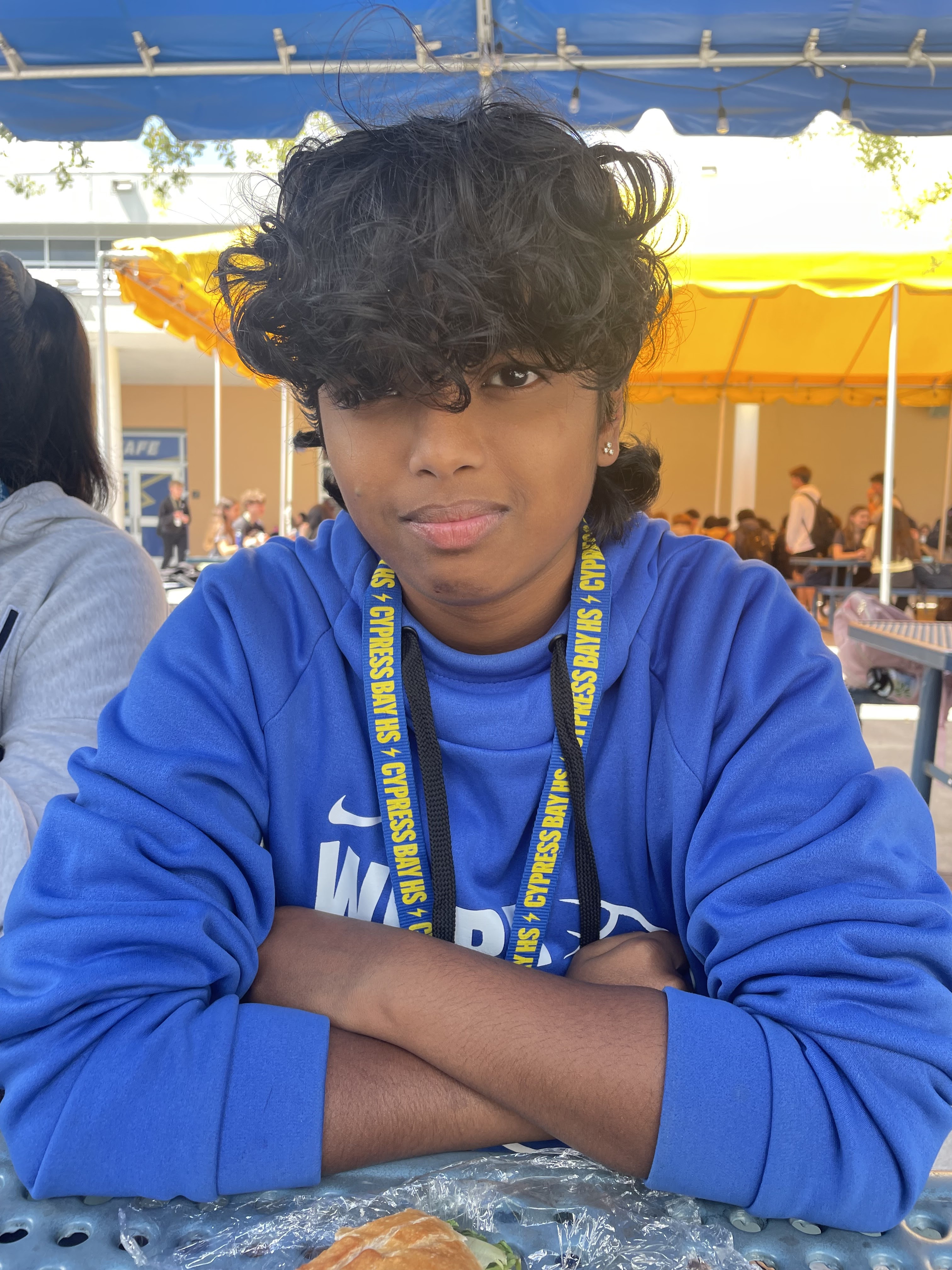
Death- Clara Pangalangan


Yellow- Ayami Ratnayake


Purple- Graesen Pethtel


Green- Mariana Aldana 


Blue- Isa Saralegui


Tuesday, March 19, 2024

Change in Filming Location

     Over the weekend while finishing the script, I knew that I would need to get a lot more shots of Death, since the ones I took before, were more test shots. While trying to coordinate how I would even get everyone I need to be in my project down to my dad's office in Doral, I realized I was sitting in my dad's new apartment, with an office room that only has a couple boxes and household items. I asked my dad if he'd be okay with the everyone coming to his apartment to film my project, and if I could move the boxes out of the room, and use it for Death's room and he agreed! 


    The blinds on the window will be fully shut during filming, and thankfully its one of those windows that faces the center of the building (its odd to explain but basically little to no sunlight gets through), so it won't interfere with the lighting inside of the room. All the other settings I wrote in the script I wrote with the specific intent of filming at my dad's apartment. Even the outdoor scene will be filmed out on the balcony. Thank goodness my dad just moved into his apartment and hasn't finished furnishing or unpacking the rooms! :D

Sunday, March 17, 2024

The Script is (Finally) Done!

     It took me long enough, but I finally finished the script! I'm really excited with what I've come up with, and I'm looking forward to getting started with filming this upcoming weekend! I'll probably make some edits here and there after this post, but here is the full Stare script!


Friday, March 15, 2024

Research For the Script

     This past week, I unfortunately didn't get as much done as I wanted to, including finishing the script. While part of the issue was lack of proper scheduling and time management admits a terribly busy week, the other half of the issue was figuring out how to create characters, particularly the green and yellow characters who are meant to depict how people who are dealing with survivors guilt or someone who is horribly afraid of dying. I want to be able to portray these specific characters as carefully as possible since they are characters that are more rooted in actual conditions and I want to make sure they are represented accurately and respectfully.
Yellow 

 
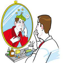
 Yellow as a character is someone who is meant to represent people with hypochondria ( also known as illness anxiety disorder) and death anxiety. Hypochondriasis, according to sciencedirect.com is the excessive fear of serious illness. People with the disorder often experience high levels of anxiety and believe that medically unexplained symptoms (MUS) are caused by serious illness. Death anxiety, is the conscious/unconscious fear of dying due to being aware that death can occur at any moment. While the associated between the two is not studied profoundly, those who experience death anxiety tend to be more prone to anxiety disorders, and it is believed that death anxiety is likely an underlying/ contributing factor to some who have Hypochondriasis. When in tandem, Hypochondriasis and death anxiety manifest through the person believing their MUS are because of issues like organ failure, and bodily damage that could lead to death. 


    As I mentioned before, Yellow is meant to be a representation of how someone may act when they have these disorders and come face to face with death itself. Instead of what I and originally intended for  the character and having them be addicted to pills, Yellow will be a person who physically looks exhausted, due to lack of sleep from hype fixating on every sensation in their body and fearing that it means their body is failing them. When the character of Death finally gets to Yellow, they are checking their temperature, and panic when they realize they have a low grade fever (even though they have a jacket on to keep the cold out) and have run out of Acetaminophen. Once they realize death is present, they panic for they believe their worst fear is coming true and that they were right about all of their MUS being caused by something more severe. 

Green


    The green character is meant to be a representation of someone with survivor's guilt after having gotten in a car accident where the person they were with unfortunately passed away. 
According to the National Library of Medicine, survivor's guilt is a response when someone survives a traumatic event, while others do not. People who experience survivor's guilt may experience symptoms like flashbacks or nightmares of the events, irritability/anger, trouble moving past the event, and having constant thoughts about what happened and that they didn't do enough to prevent the event from happening. A lot of the symptoms are similar to that of those with PTSD. 

    Within Stare, the green character will be a representation of someone with survivor's guilt. As they mourn the loss of their loved one, they can't help but blame themselves, and wonder what they could have done to prevent their death. When they notice Death, they demand to know why it wasn't them that died instead of their friend, giving a "why not me?" moment. 

Sources

https://www.healthdirect.gov.au/hypochondria

https://www.sciencedirect.com/science/article/abs/pii/S0022399918306202

https://www.ncbi.nlm.nih.gov/pmc/articles/PMC10590163/#:~:text=Survivor's%20guilt%20is%20the%20response,anxiety%20disorders%2C%20and%20complicated%20grief.

https://centerstone.org/our-resources/health-wellness/understanding-survivors-guilt/

Wednesday, March 13, 2024

Print Component Research

    Post card advertisements make it possible for filmmakers to easily advertise their films at film festivals by handing out the postcards to the people there.

Us. Them. Me. by Quincy Woo


    This is the postcard for Quincy Woo's final thesis film that was to be shown at the Oregon Independent Film Festival. The way that the postcard itself is structured draws the audience in, with the two figures on each side of the text helping to establish a more serious tone as they are cast in a shadow, almost like they are fading into the black background. This technique creates a meaning in the two character's relationship, possibly something keeping them apart, while still being connected to one another. This also allows for a reader's attention to be further drawn to the white text in the center (which stands out very well against the black background), that displays the title of the piece, the director's name, as well as the three acclaims it has already received. Having the "Official Selection" for the screening at the Oregon Independent Film Festival crest going at the top of the pyramid of three brings it to the audiences attention, and highlights it as the most recent, and relevant to the advertisement itself.

Dear Peter by Scott Willis


    Although this post card is for a short film documentary, I was still quickly captivated by its visuals, so I thought it would be of value to mention. The visuals are split in half, with a slightly distorted, picture of the lower half of a man's face being shown as it fades into a solid dark blue, where the name of the piece, who directed it, and all of its acclaims are displayed. The editing for the image of the faint blue and distortion, conveys a feeling of mystery, indicating that something is meant to be solved or figured out within the film. I really like the idea of doing a sort of fade into solid to display the information needed on the post card, I think its really effective in capturing the audiences interest. I think it would be cool to play with that and do something with multiple colors fading into black in the middle, where the name would be displayed.

Sunday, March 10, 2024

Putting Social Media Together

 The Logo/Profile Picture

    For the profile picture for the Stare Instagram page I thought of at first using a picture of Death with the word stare on it before realizing that I don't think that would look too good, and that I would much rather not have any of the character's faces on the profile photo. I did still want to somehow incorporate the room that occupies the majority of the setting in the logo. So, I decided to use a picture that I had taken of one of the corners of the room as the main background for my profile picture. 
First option.
    The next thing I did was plaster "Stare " right onto the middle of the image. Then began my hunt for the perfect font. Thankfully I didn't have to go too far, as I found one on Canva called "Bahianita". I picked this font because I felt it reflected the atmosphere that I am trying to create for my project very well, something sort of abstract while still understandable. I went through some different options in terms of how I wanted the title to be displayed since I wanted each character to be represented somehow. I was torn between two options but in the end I ended up with "Stare" in the middle in solid black, with very translucent, multicolored versions of the word spread throughout the image, these representing all the other characters. I liked the first option, however I didn't want the colors to be as prominent as they were in that option, as well as I didn't want the corner of the wall to be covered. It's safe to say I am thrilled with the final result.

Final choice.

    Once I made the logo, I added it to the social media page on Instagram which is linked here: @stare.shortfilm

First Post

    For my first post, I decided to create a very short reel of the empty room and then Death appearing out of thin air. I took some of the clips that I had taken last weekend, and edited them together using CapCut. I removed the sound from both of the clips, and added a copyright free sound of florescent lights buzzing over the second clip to create a more ominous atmosphere. I also desaturated the clips since that is how Death is meant to start out looking as at the beginning of my film. 


Monday, March 4, 2024

First Group Meeting


    Today in class, we did group meetings for our portfolio projects, and it was honestly incredibly helpful. We went around and talked about each individual project. We all said that we we're struggling with scheduling since, it seems to be, that March is a ridiculously busy time of year for everyone. The first person to talk about their project was Tai. She was having trouble figuring out when to film, since she's incredibly busy, and will be leaving for a family trip over spring break. The group suggested to plan out as much as possible with her group and write the script in order to be better able to find time when to film. Migue went next, and his project sounds super interesting. He's doing a silent short film, and using dance as his form of communicating the story. He asked for ideas on locations, since he wants to do it in an empty white studio but wasn't sure where to do it. We offered some ideas, I suggested the Rubell Museum, since he had mentioned that our teacher suggested an art gallery if he isn't able to get an empty studio. He took note of the ideas we gave him, and I'm honestly super excited to see what he ends up doing.

    Yoav, Morgan, and Abby are all doing film promos. Morgan had the idea to make each of the two trailers a different perspective of one of the main characters. We all liked the idea and said it would be really cool. Yoav expressed his issue with scheduling because of how busy he is and the availability of the people he wants to be in his documentary. Abby asked for advice on what to do for the social media component. This in particular was helpful to me, since I wasn't entirely sure what to do either. Tai suggested doing a banner like post, where each individual post ends up creating a bigger image on the Instagram grid.

    I went last in my group, and after explaining the concept of my project, Tai pointed out that I'd have to be careful with how I show the colors since blue and yellow specifically are often associated with sadness and happiness and not peace and obsession. I explained that I plan on using a light blue, almost like an angelic blue, and a nastier looking yellow to showcase the perspectives I'm creating. I then asked the group for advice on what to do for social media, and Abby suggested doing highlights, one of for each color and perspective, and in each highlight I explore the perspective itself. I like this idea a lot, and will most likely implement it later down the line. The group also suggested I did a banner post, although I'm not quite sure what I'd do for that. Overall, though, I feel like it was a really helpful and productive group meeting.

Sunday, March 3, 2024

Test Shots & Social Media

Capturing Test Shots

    As mentioned in my previous post, I spent a good portion of my Saturday driving down to my dad's office in Doral to get some practice shots for my short film, so I can start experimenting with editing, as well as get content for the social media page. I didn't just go down to Doral to get shots of an empty conference room though, I was able to have my best friend, who I met through doing theater outside of school, Clara Pangalangan to come with me. They will be playing the personification of death. I picked them specifically, because I knew that they'd be able to capture the monotone yet haunting look that I was looking for when I first thought of the idea for Stare

      When we got to the office, I was a little disappointed to see that the table was a lot bigger than I had originally thought, as I wasn't able to move it out of the room. however the wall were bare aside from a white board and a map that I could easily just avoid filming. We did have to work around the table and rolling chairs, which was quiet funny at times since we were situating everything and moving around, only to realize there was the corner of a rolling chair appearing at the very corner of the frame. At one point, I literally sat on the table in order to get an angle of the shot of Clara standing in the corner (shown above).

    I got quite a few shots of them in the room, walking, and turning. I even got a shot of them staring at the camera, with a sunset lamp shining in their face, since I was trying to experiment with how I would show the end sequence of "Death" having collected all the colors. Unfortunately, I'm not entirely convinced of the sunset lamp creating the look I wanted but I still think the shot itself looks pretty cool. I also had Clara bring some colorful clothes, so I could experiment with editing and color isolation, but I will see how that goes later on this week.

Starting Social Media Page


    This week we are supposed to start the social media aspect of our project, so that's exactly what I have done. I opened up an Instagram page, as I felt Instagram would be versatile enough to allow me to create various post types like  video clips and images. I plan on taking inspiration from the Midsommar social media page, and creating some form of countdown later down the line, one in which each character is highlighted in each post. As for now though, I have created the profile @stare.shortfilm. This upcoming week I plan on creating the profile photo, and initial posts. 
 

Beginning of Script Writing & Finding a Name

Script Writing

    In class this week, I focused on writing my script. I had originally planned on finishing it and beginning filming on Saturday March 2nd, but I then realized that was entirely unrealistic, especially if I want to create something of real quality. I did still end up getting some shots at my dad's office, since he has a pretty empty conference room so I can practice and experiment with editing and have some content for the social media page, but more on that in the next post.

  I am not yet done with the script, however as I am writing I am realizing more how dependent the piece is going to be on specific props and costumes in order to tell each character's story in the most effective way possible. This is going to be even more challenging since I am limited to the resources I currently have and a very limited amount of money I could actually spend on getting props that I can't find on my own. Good thing the dollar store exists. 

    Throughout the script, I also decided to not add names to the characters. They are simply identified by the color that characterizes them, or in the personification of death, just "Death". I thought of doing this because in not giving them a name, the characters can represent anyone. It is also just more simple at this point in the writing process. Them having or not having names will not effect the plot, however I do acknowledge they could represent anyone even if they did have names. 


"Stare"

 
   Another realization that dawned on me while working on the script, was that I needed a title for the short film. At first I thought of naming it "The Room" since the main setting took place in a room, but that didn't go with what I was trying to create. It made the short film feel more like a horror situation, which is not what i am going for. Just "Room" didn't work either as, again, it didn't quite go with what I wanted, and also there is a very popular 2019 movie staring Brie Larson with the exact same name. I tried experimenting with maybe making the title the name of the character that would be personifying "Death" but I couldn't find a name that really stuck, and I also didn't want "death" to be something that could be so easily identified by a name since the whole point of the short film is how death can be perceived in many ways, and it is not just tied down to one label or perception. 
   
     I still had no title for my short film and felt completely stuck. Out of no where, I'm washing my hair and getting ready to go to the office to get some practice shots for the project, when the name "Stare" dawned on me. It was perfect. It encapsulates my film as a whole without giving anything away. "Stare" literally refers to the fact that the personification of death is always staring directly at the camera, but it also refers to the idea that all the characters which "Death" encounters, have death staring them in the face, and subsequentially, so does the audience. 


Project Components

       Well, that's a wrap! Bellow are the links to the project components! Enjoy :) Instagram: @stare.shortfilm Postcard: Front of Pos...